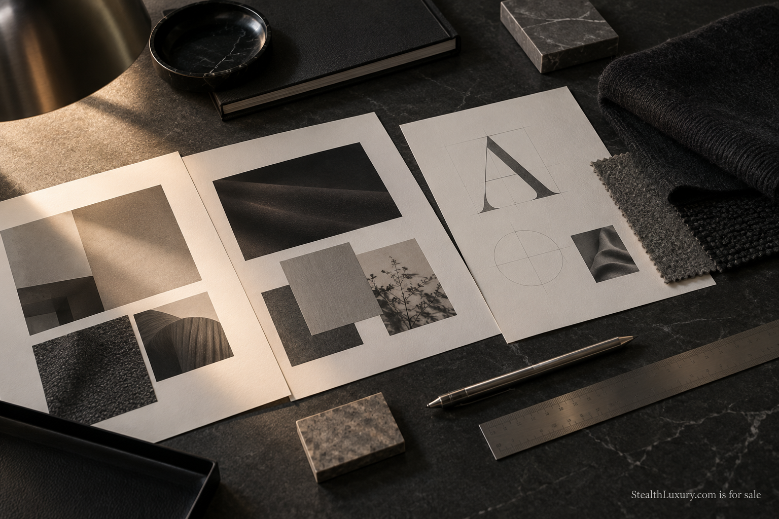
A quiet-luxury brief fails in familiar ways. The deck says restraint. The logo still needs to be huge. The photos still chase faces and flash. The claims still sound like a nightclub launch. This guide is a working checklist for writing a brief that keeps restraint intact from strategy through production.
Examples are illustrative. This is not legal advice and not a promise about any specific brand outcome.
Start with the decision the brief must protect
Before fonts and layouts, write one sentence that names the behavior you refuse. Example: “We will not enlarge the mark to compensate for a thin product story.” Another: “We will not use face-forward celebrity theater as proof of quality.” That refusal sentence becomes the filter for every later section.
Quiet luxury is not the absence of branding. It is a hierarchy. Materials, fit, service, and place do more work than logo volume. Your brief should say what carries the proof. If the product cannot carry proof yet, fix the product plan. Do not ask design to shout louder.
Audience and job, without lifestyle fog
Write the audience as a job to be done, not as a moodboard tribe. “Professionals who buy fewer pieces and prefer private referrals” is usable. “Discerning global citizens of taste” is not. Include geography, purchase context, and what they already distrust (logo piles, invented scarcity, unverifiable heritage claims).
Add a negative audience. Who is this not for? People hunting hype drops. People who want max logo visibility. Teams that need clinical claims. Negative audience text prevents later “just make it louder for awareness” requests.
Logo size and mark rules
Put logo rules in numbers where you can:
- Maximum mark height on primary packaging or apparel placement.
- Where the mark may appear once versus repeat as a pattern (usually: do not pattern it).
- When to use wordmark alone versus symbol.
- What happens on monochrome applications and embroidery.
Ask the team to print a life-size mock. Screen decks hide scale problems. If the mark still feels weak at honest size, the issue may be letterspacing, contrast, or product photography, not “needs to be bigger.”
For apparel, specify distance at which a viewer should notice material before mark. That single note stops a lot of backseat driving in fittings.
Photography rules that match the claim
Quiet-luxury photography often fails by copying loud luxury habits: champagne sprays, supercar stacks, influencer faces as the product. Write a shot list that privileges materials, spaces, hands-only service, and unfinished craft moments when they teach something real.
Required brief lines:
- Faces: allowed, limited, or avoided for this campaign.
- Locations: real, controlled, no address reveals.
- Retouching: what must stay honest (fabric hand, stone texture, skin if faces appear).
- Props: what is banned (gold logo piles, fake UI screens, mockup crops as hero art).
Pair this with the Resources post on photographing luxury offers without faces when your default is privacy-aware work.
Industry craft discussions on still-life and editorial restraint appear across photography and design publications; use them to train taste, not to copy layouts. The brief should still name your own constraints.
Typography and color without costume
Quiet-luxury briefs often over-specify fonts as if type alone creates restraint. Give designers a short range: one serif or refined sans for the house, one functional sans for UI, limited weights. Ban novelty scripts that costume the brand as “old money.” Color guidance should prefer graphite, stone, soft neutrals, and one restrained accent. Metallic gold as a default signal often fights the posture.
Ask for a type specimen at actual sizes used on hangtags and mobile screens. Beauty in a 90-point presentation slide is not the same as clarity at 9 points on a care label.
Motion rules belong here too. If social templates auto-add loud whoosh transitions and sticker packs, disable them. Restraint includes what the template will not do.
Claim language: what you may say
Write three columns: allowed claims, claims that need evidence, and banned phrases. Allowed might include material composition, place of finishing, service hours, and membership posture. Evidence-needed might include durability tests or heritage dates. Banned might include unverifiable “most exclusive,” invented sell-through, and medical-sounding promises.
Quiet luxury dies when copy borrows hype cadence. Cut stock intensifiers. Prefer concrete nouns: micron count if true, stitch type if true, service steps if true. If you cannot name a fact, do not decorate the gap.
For regulated categories, route claims through counsel. This checklist does not replace that review.
Evidence and references without a sources dump
When a brief cites a cultural shift toward quiet luxury, keep the citation light and specific. Link a trade or business article that actually discusses restraint in luxury marketing, then return to your own rules. Do not paste a reading list at the end. Operators need decisions, not a bibliography.
Useful external reading might include coverage of quiet-luxury positioning in business press such as pieces indexed on Business of Fashion. Use those pieces to pressure-test your refusal sentence, then write your own constraints for logo, photo, and claims.
If your category is regulated, separate cultural reading from compliance reading. Mixing them in one paragraph confuses designers and counsel alike.
Channel rules and production handoff
A brief should state where restraint can flex and where it cannot. Example: paid social may crop tighter, but it may not enlarge the mark beyond packaging rules. Email may tell a longer materials story. Outdoor may rely on a single object and a short line.
Handoff package:
- Refusal sentence and negative audience.
- Mark size rules with life-size mock photos.
- Shot list and banned props.
- Claims table.
- Examples of weak versus stronger lines (two or three pairs).
Weak versus stronger example:
- Weak: “Elevate your lifestyle with ultimate exclusivity.”
- Stronger: “A travel knit in charcoal merino, finished in our studio, shipped with care notes.”
Stakeholder review without diluting restraint
Quiet-luxury briefs often die in the approval thread. Someone asks for more energy. Someone else wants the mark larger for “awareness.” Someone pastes a competitor ad that shouts. Build a review ritual that returns to the refusal sentence before any visual change is approved.
Practical meeting rules help. One screen shows the refusal sentence and negative audience for the entire review. One screen shows the life-size mark mock. No new “inspiration” slides mid-meeting unless they answer a listed decision. If a stakeholder cannot name the decision, park the request.
Document the outcome in the brief appendix: what was asked, what was refused, and why. Future freelancers need that history. Otherwise every new hire reopens the logo-size argument from zero.
When legal or compliance joins, give them the claims table first, not the moodboard. Compliance reads facts. Design can wait fifteen minutes.
Checklist to apply on one campaign
Print this and mark pass/fail before production:
- Refusal sentence present and specific.
- Audience written as a job, with a negative audience.
- Logo size rules numeric and mocked at life size.
- Photography rules cover faces, locations, retouching, banned props.
- Claims table filled; banned phrases listed.
- Channel flex rules written.
- One weak/stronger copy pair approved.
Apply the checklist to one real campaign this month. If a stakeholder asks to “make the logo pop,” return to the refusal sentence. If the product story is thin, fix the offer. The brief is there to protect the posture you already chose.
For naming architecture after the brief, see the post on keeping the house name stable while SKUs change. For day-to-day privacy habits that affect shoots and vendors, see operational habits that protect client discretion.